Monday 21 March 2011
Sunday 20 March 2011
Monday 14 March 2011
Filming Schedule

To ensure I filmed all the shots that were essential to the story, I needed to create a filming schedule to have with me during filming. Before hand I carefully studied the schedule to familiarise myself with all the shots that were needed, this was to make it easier to see while shooting.
I divided the schedule into specific character shots, having a list of shots needed with the Dancer, the Masked Character, the couple and the Girl and Boy individually. As well as this I put on the locations and then colour coded them later. I also put columns for 'Action', in which I wrote a narrative description for what happens in the certain scene. I also put extra notes need for the shoot, for instance, equipment checks, angles, things to take into consideration whilst on location.


Original Colour Coded Filming Schedule


Saturday 12 March 2011
Band Website
The internet is one of the largest ways to communicate with an audience in the modern world. The target audience I established, for the Gothic/Metal band Evanescence was predominantly teenagers, however I saw that the genre span through all ages. Due to social networking sites such as: Facebook, myspace and twitter, as well as chat sites, blogs and video generators like Youtube and Vimeo, teenagers are constantly encouraged to use the internet. This allows for bands to advertise and publicise through the internet to communicate with its audience.
To make my website I first had to research other examples of websites to gain an understanding of the kinds of things expected.


Some of the different sections included: Events, News, History and Multimedia. I aimed to incorporate these aspects into my website, to make the website appeal to the target audience. The colours and images in the websites are appropriate to the genre and style of the band, so with the Gothic genre, conventionally dark colours and images would be expected.
In the website I created for Evanescence, I made the themes link with the genre. For instance, I stuck to dark colours for the background to be in keeping with the dark tone of the music. The blue colour I used also relates very strongly to the cover of the Evanescence album 'Fallen', from which the song I have chosen was taken from. Some of the text I specifically put in red, not only to stand out but also to represent the romantic theme within the genre and also symbolising blood representing the common themes of death and anger. The slogan I put at the top reads 'We rock because we don't care'. I created this to express the bands individualistic nature, and the rebellious attitude they hold which is different to other bands. Where as some artists or bands aim to show their audience love and kindness to draw them in, Evanescence would oppose this approach and present an uncaring, 'bad ass' attitude which attracts the target audience. It is also written as if it was a quote by lead vocalist Amy Lee, again presenting a certain look that she is very individualistic and almost aggressive, relating back to the tone of the music.
Most band/artist website pages give the opportunity to 'sign-up' or 'subscribe' to an online magazine almost. Usually this generates income for the band, as the customers pay to receive exclusive extra features such as the latest band news, new tracks, interviews etc. I incorporated this aspect. By having a 'Join up now' system, it would appeal to the audiences and more devote fans who want to access exclusive information on the band and receive their latest updates. This is a very important aspect expected in a website for fan clubs and subscribers, so without this the band/artist would be denying its audiences the chance for more in-depth interaction and possibly condense its audience range.

There are often competitions on the websites to generate a wider audience. In my website the competitions post is appropriately sponsored by the energy drink Relentless. This was to appeal to the target audience of teenagers, which is the same as the drink. The Gothic style typography also links appropriately with the band and gives it a popular reputation in the eyes of youth and teenagers.
By including some free information or history about the band, draws the audience in, giving them an insight to the style, genre and image of the band. I included a history section of the website to show the bands status in the last ten years and how the band has progressed and excelled in the eyes of the modern day audience.
Band Merchandise is usually quite common among band websites. When ever you go to see a band live, the merchandise table makes lots of money. So by having a similar system online allows a wider choice of items from clothing to accessories without the waiting in queues. I also put on my post that members and subscribers would gain discounts and special deals when purchasing merchandise. This would again encourage the fans and target audience to sign up online, gaining more support for the band.
By showing a link with a popular UK ticket office such as 'Ticket Master' the website encourages fans and subscribers to partake in live music concerts and by showing the bands association with the ticket office, it would encourage people to uses that ticket office. This kind of advertising would gain an income for the website and the band.
 In the website I have put many images of the band and the more the enticing female lead Amy Lee. I also put a video link to the music video 'Call Me When Your Sober' on youtube. This was to give the audience a taste of the music, and also an idea of the bands style and genre. Usually band websites make the assumption that viewers will most likely be already familiar with the music, however this approach is unhelpful for people with little knowledge of the band. It is also unlikely that people will subscribe to a website without knowing what it is exactly they are subscribing to.
http://anmer22.weebly.com/ Copy and paste this into the search bar to view the web page.
To make my website I first had to research other examples of websites to gain an understanding of the kinds of things expected.


Some of the different sections included: Events, News, History and Multimedia. I aimed to incorporate these aspects into my website, to make the website appeal to the target audience. The colours and images in the websites are appropriate to the genre and style of the band, so with the Gothic genre, conventionally dark colours and images would be expected.
In the website I created for Evanescence, I made the themes link with the genre. For instance, I stuck to dark colours for the background to be in keeping with the dark tone of the music. The blue colour I used also relates very strongly to the cover of the Evanescence album 'Fallen', from which the song I have chosen was taken from. Some of the text I specifically put in red, not only to stand out but also to represent the romantic theme within the genre and also symbolising blood representing the common themes of death and anger.
 The slogan I put at the top reads 'We rock because we don't care'. I created this to express the bands individualistic nature, and the rebellious attitude they hold which is different to other bands. Where as some artists or bands aim to show their audience love and kindness to draw them in, Evanescence would oppose this approach and present an uncaring, 'bad ass' attitude which attracts the target audience. It is also written as if it was a quote by lead vocalist Amy Lee, again presenting a certain look that she is very individualistic and almost aggressive, relating back to the tone of the music.
Most band/artist website pages give the opportunity to 'sign-up' or 'subscribe' to an online magazine almost. Usually this generates income for the band, as the customers pay to receive exclusive extra features such as the latest band news, new tracks, interviews etc. I incorporated this aspect. By having a 'Join up now' system, it would appeal to the audiences and more devote fans who want to access exclusive information on the band and receive their latest updates. This is a very important aspect expected in a website for fan clubs and subscribers, so without this the band/artist would be denying its audiences the chance for more in-depth interaction and possibly condense its audience range.

There are often competitions on the websites to generate a wider audience. In my website the competitions post is appropriately sponsored by the energy drink Relentless. This was to appeal to the target audience of teenagers, which is the same as the drink. The Gothic style typography also links appropriately with the band and gives it a popular reputation in the eyes of youth and teenagers.
By including some free information or history about the band, draws the audience in, giving them an insight to the style, genre and image of the band. I included a history section of the website to show the bands status in the last ten years and how the band has progressed and excelled in the eyes of the modern day audience.
Band Merchandise is usually quite common among band websites. When ever you go to see a band live, the merchandise table makes lots of money. So by having a similar system online allows a wider choice of items from clothing to accessories without the waiting in queues. I also put on my post that members and subscribers would gain discounts and special deals when purchasing merchandise. This would again encourage the fans and target audience to sign up online, gaining more support for the band.
By showing a link with a popular UK ticket office such as 'Ticket Master' the website encourages fans and subscribers to partake in live music concerts and by showing the bands association with the ticket office, it would encourage people to uses that ticket office. This kind of advertising would gain an income for the website and the band.
 In the website I have put many images of the band and the more the enticing female lead Amy Lee. I also put a video link to the music video 'Call Me When Your Sober' on youtube. This was to give the audience a taste of the music, and also an idea of the bands style and genre. Usually band websites make the assumption that viewers will most likely be already familiar with the music, however this approach is unhelpful for people with little knowledge of the band. It is also unlikely that people will subscribe to a website without knowing what it is exactly they are subscribing to.
http://anmer22.weebly.com/ Copy and paste this into the search bar to view the web page.
Saturday 5 March 2011
The Digipak
To make a digipak appropriate for the genre, my main intention is to incorporate the themes, conventions and characteristics of the Gothic genre. Art work is very important to stand out and grab the audiences attention. From my research I have already discovered that the fantasy style artwork is very strongly linked with the gothic genre, so to appeal to my target audience the following themes and emotions I will aim to convey: Horror, Romance, Fantasy, Sadness, Anger and Fear.


The many different artistic styles of digipak can relate to the Genres individually. To relate to the Gothic genre, my digipak would be produced to have 3D aspects to symbolise the boundaries between reality and the imaginary, a strong convention to the Gothic Metal style music.

Almost all digipaks contain a booklet, sometimes with information about the band/artist, the album or simply artwork. Evanescence usually have the lyrics on the inside booklet to allow the audience to fully understand the songs and also to provide a written narrative as well as through music. The lyrics of the song are extremely important to the narrative and theatrical nature of the music, therefor in my digipak I will include the lyrics for each of the songs. Other aspects I will include in my digipack will be; artwork of the band, and conventionally gothic images relating to the style of music.

The Front and Back Cover

For the front cover of the album, I needed to make sure it would attract the target audience. I also intended to make sure the front cover reflected the genre and addressed certain themes and motifs within the Gothic genre. This picture (Right) was my first design for the front cover of the album. The very Gothic style artwork on a white background shows a red rose in the centre of a sharp and conventionally Gothic symbol. The rose represents the romantic themes within the genre, which is contrasted with the black symbol almost showing wings of some sort of supernatural creature. The rose could also symbolise a heart, again emphasising the romance theme within the genre. The important contrast between the horror and romance themes of the Gothic genre is also expressed through the black on white look, as well as being a very effective use of colour contrasting with the red of the rose.

I then wanted a cover to show the themes of horror and truly express its importance to the Gothic genre. Evanescence usually portray stories with some sort of element of horror in through their music. The band often play dark, morbid, metal music, which conveys a sense of horror, as well as the obvious language and narrative told through the lyrics. Linking appropriately to nightmares and horror, I chose a piece of artwork showing an old, haunted looking and nightmarish house. I saw this as a very conventional image associated with the Gothic horror genre, and would be expected by this bands target audience.

The back cover I created would be put with the second front cover, of the haunted house. The back cover shows the inside of an old, Gothic, haunted house. My aim with this was to draw the audience in, bringing them into the story and the narrative as soon as they look at the back cover. The hanging picture of the lead vocalist makes the association the band has with the narrative, giving the image that she is more of a character than simply a singer. Next to her picture I made a quote to draw the audience in saying "My home is your hell", again making the connection with horror and also narrative within the design. The songs I listed on the back were the ones I would strongly associate with the horror genre, linking with the design. Also the different sizes of text create a nice 3D effect suggesting a different dimensional realm, such as a dream or a nightmare, which is one of my main focuses with this genre.
The CD

The CD designs were on a very basic level. Through research on Gothic CD they are often some sort of pattern or Gothic styles. I intended to take what I've learnt from research and apply it to the designs. The left design shows a traditionally Gothic pattern, with very sharp edges and elegant curls. The right design makes the link between fantasy and the Gothic genre, showing a dark image of a magical creature with wings. The image works very effectively in interesting the audience and offering an insight into the inner narrative of the band.
The Booklet

An important aspect to the booklet is some background information on the band/artist to attract the target audience. The background to this page is an image of a graveyard to express the horror sub-genre.
The next three images would be overlapped with the lyrics, as this appeals to the target audience. The background image relates to the relationship the Gothic genre and nature. The next few images show the juxtaposition of religous aspects such as: heaven and hell, death and the apocalypse. Continuing with two pages of lyrics, they show the many themes the songs go into. The artwork on the left shows religous images such as death and angels. The next image is a very apocalyptic image of the angel of death bringing about the destruction of the world, a very appropriate link to destruction and despair.

The next two pages are dedicated to the band, showing personal profiles of the members and a creative introduction to the theatrical narrative of the album. The images used are of the band and the lead vocalist Amy Lee in her 'character' role, with a set suggesting the imaginative world the 'story' is taking place.


The many different artistic styles of digipak can relate to the Genres individually. To relate to the Gothic genre, my digipak would be produced to have 3D aspects to symbolise the boundaries between reality and the imaginary, a strong convention to the Gothic Metal style music.

Almost all digipaks contain a booklet, sometimes with information about the band/artist, the album or simply artwork. Evanescence usually have the lyrics on the inside booklet to allow the audience to fully understand the songs and also to provide a written narrative as well as through music. The lyrics of the song are extremely important to the narrative and theatrical nature of the music, therefor in my digipak I will include the lyrics for each of the songs. Other aspects I will include in my digipack will be; artwork of the band, and conventionally gothic images relating to the style of music.

The Front and Back Cover
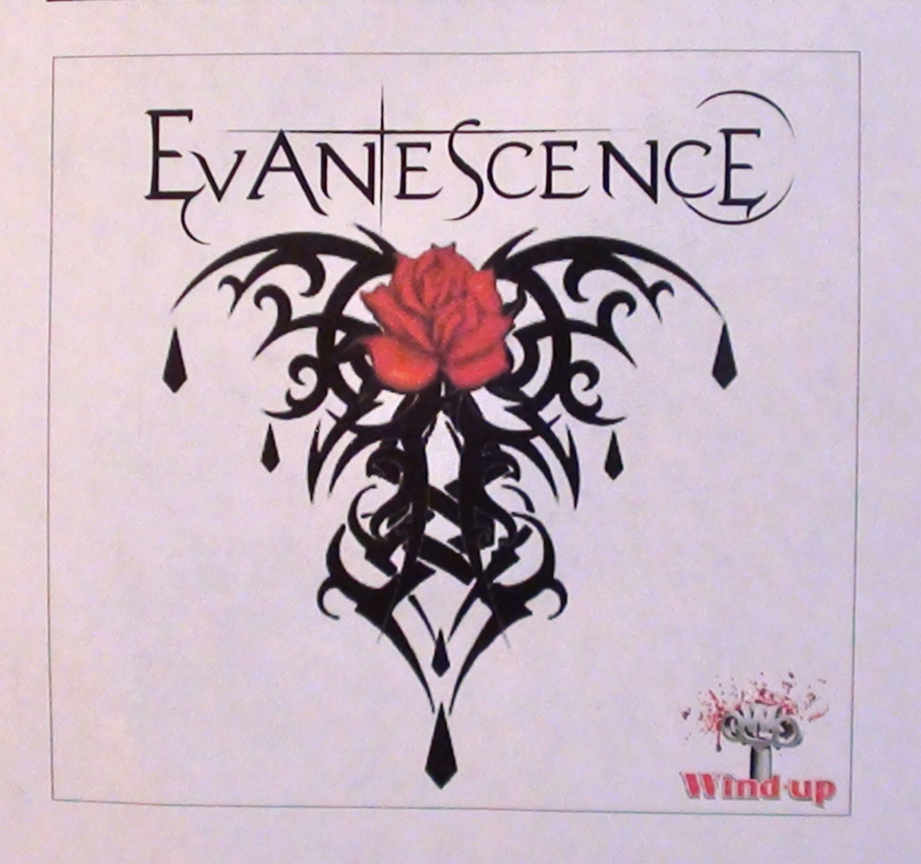
For the front cover of the album, I needed to make sure it would attract the target audience. I also intended to make sure the front cover reflected the genre and addressed certain themes and motifs within the Gothic genre. This picture (Right) was my first design for the front cover of the album. The very Gothic style artwork on a white background shows a red rose in the centre of a sharp and conventionally Gothic symbol. The rose represents the romantic themes within the genre, which is contrasted with the black symbol almost showing wings of some sort of supernatural creature. The rose could also symbolise a heart, again emphasising the romance theme within the genre. The important contrast between the horror and romance themes of the Gothic genre is also expressed through the black on white look, as well as being a very effective use of colour contrasting with the red of the rose.

I then wanted a cover to show the themes of horror and truly express its importance to the Gothic genre. Evanescence usually portray stories with some sort of element of horror in through their music. The band often play dark, morbid, metal music, which conveys a sense of horror, as well as the obvious language and narrative told through the lyrics. Linking appropriately to nightmares and horror, I chose a piece of artwork showing an old, haunted looking and nightmarish house. I saw this as a very conventional image associated with the Gothic horror genre, and would be expected by this bands target audience.

The back cover I created would be put with the second front cover, of the haunted house. The back cover shows the inside of an old, Gothic, haunted house. My aim with this was to draw the audience in, bringing them into the story and the narrative as soon as they look at the back cover. The hanging picture of the lead vocalist makes the association the band has with the narrative, giving the image that she is more of a character than simply a singer. Next to her picture I made a quote to draw the audience in saying "My home is your hell", again making the connection with horror and also narrative within the design. The songs I listed on the back were the ones I would strongly associate with the horror genre, linking with the design. Also the different sizes of text create a nice 3D effect suggesting a different dimensional realm, such as a dream or a nightmare, which is one of my main focuses with this genre.
The CD

The CD designs were on a very basic level. Through research on Gothic CD they are often some sort of pattern or Gothic styles. I intended to take what I've learnt from research and apply it to the designs. The left design shows a traditionally Gothic pattern, with very sharp edges and elegant curls. The right design makes the link between fantasy and the Gothic genre, showing a dark image of a magical creature with wings. The image works very effectively in interesting the audience and offering an insight into the inner narrative of the band.
The Booklet

An important aspect to the booklet is some background information on the band/artist to attract the target audience. The background to this page is an image of a graveyard to express the horror sub-genre.
The next three images would be overlapped with the lyrics, as this appeals to the target audience. The background image relates to the relationship the Gothic genre and nature. The next few images show the juxtaposition of religous aspects such as: heaven and hell, death and the apocalypse. Continuing with two pages of lyrics, they show the many themes the songs go into. The artwork on the left shows religous images such as death and angels. The next image is a very apocalyptic image of the angel of death bringing about the destruction of the world, a very appropriate link to destruction and despair.

The next two pages are dedicated to the band, showing personal profiles of the members and a creative introduction to the theatrical narrative of the album. The images used are of the band and the lead vocalist Amy Lee in her 'character' role, with a set suggesting the imaginative world the 'story' is taking place.

Subscribe to:
Posts (Atom)