Sunday, 10 April 2011

How did you use new media technologies in the research, planning, construction and evaluation stages of your main text?


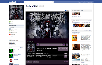
Through out all of the stages of my project, the use of new media technology was essential. During the research and planning stages I needed to use the internet to discover the market and audience of music videos, through this I was able to view online, videos, pictures and interviews with bands, directors and audience members. The internet allowed me to communicate to an audience over social networking and explore views of the masses, something that would not have been possible without the use of the internet. I visited blogs of bands to discover their target audiences, as well as joining groups on Facebook, Twitter and Myspace to observe comments expressing the audience response. I used this information to inform my decisions when planning my own music videos to show how my research was helpful to me and how I applied the knowledge I gained to my own work.
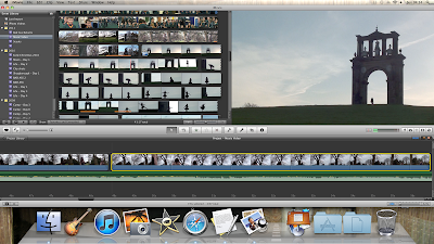

Throughout the construction of my music video many aspects involved the use of media technology such as; filming and post-production. To film my music video I used a High Definition handy cam, stored on SD cards it meant I could take the shots I filmed and upload them to any computer for post-production. The use of SD cards allowed me to simply upload the chosen clips and then clear the space for more filming. The camera was obviously the most essential piece of kit needed for the shoot, so from this I learnt the importance of using new media technology. As-well as filming the camera picked up intense detail, making the shots more vivid and realistic. This was down to the quality of the camera, however without a slow motion mode the clips would need to be slowed and sped up in post-production. Through use of movie editing software on Macs such as imovie, the post-production stages allowed me to have total control over my work. Certain aspects such as cutting, colour correction, speed and steadying helped enormously to bring the work together. Some say that it is the editing, not the directing that makes a movie, and I totally agree, through the use of editing I was able to give the video a sense of pace and rhythm through the cutting, choosing the exact moments of footage and applying them to set times in the song. The obvious evidence of the use of media technology in my video is through colour changing to create narrative. I made the skies purple in post production to link with the narrative and story of the piece. This shows how I used media technology to create and convey narrative through my work.
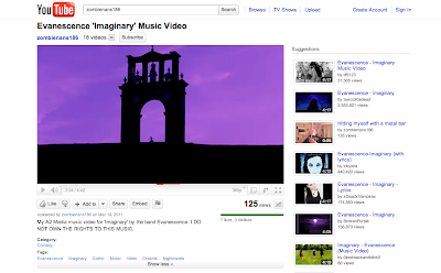
Finally through the distribution and evaluation stages, I used online distribution through sites such as Youtube and Vimeo to show my video online. This also helped to gather a wider audience response and feedback from commenting and messaging. I was able to view my video and deconstruct it to evaluate and analyse it. I also overlapped the original track of music with a voice over of my directors commentary. This allowed me to show my views on the video and express the problems I faced during filming, post-production and more importantly how I solved them.

Saturday, 9 April 2011

Evaluation: What have you learned from your audience feedback?

To gather the audience feedback required for my evaluation of my music video, I used social networking to my advantage. I sent out a mass email asking for constructive criticism, positive and negative feedback, and a link to the actual video on youtube.

The feedback I received was very useful in telling me what worked well and faults that could have been addressed or improved:

Genrally I had positive feedback. It appealed to the wider audience, and successfully communicated the genre and themes. However through the feedback some of the viewers did point out some opportunities for improvement. Some pointed out specific faults and errors in the video, misplacement of mise en scene, including props and slight costume changes among shots. This occurred because of the filming schedule. We had to make sure that the conditions of weather were the same for continuity purposes. This meant it was important to film when ever we could to ensure this continuity. However, filming on different days did make the risks larger when dealing with smaller, more specific continuity errors. Being picked out by the audience expresses the importance of continuity and the improve this in future productions, I would carefully study the shots and list all possible changes to watch out for. This in depth analysis of the shots would prevent the risk of continuity errors in my film.

The narrative and theatrical structure within the piece was successfully recognised by the audience. I received many other positive comments expressing the structure of the story and how well that linked to the genre. Other genre characteristics were also successfully communicated to the audience, and were recognised as being Gothic attributes.
A common comment was containing the costume and more specifically 'the masks'. The reasons for the masks were clearly communicated to the audience, to maintain the horror within the Gothic genre, an essential theme within the narrative. They successfully gathered my intended audience reaction, and were obviously seen as frightening and surreal making them even more effective as a way to convey the sub-genre.

The most common compliment I received was on the 'hillside silhouette' shots, personally my most impressive shot. The reason the shot works so well was due to the natural lighting. Obviously the video is 90% filmed outside and the use of un-natural lighting would have been impossible, however in my opinion this only added to the intensity of the shot. The hillside shots were particularly effective because of the time of day. We arrived at location just as the sun was going down, and as we set up the shot the sun faded just behind the monument. I centred the dancing in the middle of the monument and filmed until the sun went down. In post-production I saw how effective the shot was and it was clear that to make this even more impressive, I would make a direct link to the lyrics of the song and apply 'purple sky' to the shot.

Friday, 8 April 2011

Evaluation: How effective is the combination of your main product and ancillary texts?

The combination of my three pieces work very effectively because the two ancillary tasks reflect the common themes and genre of the main task. For the main piece I created a music video for the Gothic/Metal band Evanescence. This product used representation, themes and conventions of the Gothic genre to display a narrative. This meant that I had to convey the same themes within the ancillary tasks; a website and a digi-pack. Obviously all the tasks were created for the same band, however to communicate a clear attitude of the band the themes and imagery needed to be constant throughout the three tasks. I aimed to keep the colour very dark and low-key in all my pieces to conform to the style of the genre and common morbid themes which are also expected. The backgrounds to the webpage and digi-pack, as well as the constant dark images in the music video, all reflect this morbid sense of the Gothic nature.

The themes of horror ran constant throughout the three pieces. This is because of intentions to emphasise horror through the narrative, which appealed strongly to me as I discovered this is very individualistic and specific to the Gothic genre. To convey this I crated a strong visual images, such as the masks worn by the characters in my music video. This creates an obvious link to the horror sub-genre as well as playing a hugely important role in the narrative. This narrative link to horror continues with my final cover designs for the band's album, taking the Gothic story of a haunted house and applying a narrative to the album as a whole. This is a positive and direct link to the music video and suggests the style of music, conventions and expectation of a very theatrical and narrative based album.

I think I have successfully communicated the themes and aims of the band, and their style of music through the three tasks. I see this as an effective combination of the website, to express the mindset and target audience of the band, and the common narrative, and representation used within the album's digi-pack and the music video for the song 'Imaginary'.

Sunday, 3 April 2011

Evaluation: In what ways does your media product use develop or challenge forms and conventions of real media products?

Through research I have managed to gain a sufficient knowledge and understanding of the typical forms and conventions of music videos. I understand through analysis of Goodwin's theory what is expected and unexpected of a music video. Obviously music videos differ for different genres, some 'Hip-hop' or 'Pop' music videos might focus on images of the artists or a live performance suggested through Goodwin's theory, where as I chose to do the Gothic Metal genre, which often contains some sort of narrative. Often in music videos of this genre there is a strong narrative flow so I did choose to conform to this style of video. I wanted to make sure the narrative was the most important aspect of my music video, so I created a storyline that would reflect the genre its common themes and conventions. I gained this information through research, learning that common themes within the Gothic genre include: horror, romance, nature and fantasy, all of which I intentionally presented within my video.

Horror

Being probably the most important theme of the genre I needed to presented the theme through many different techniques and visuals, linking with the lyrics, style of music and the genre itself. I feel I emphasised the horror through the narrative and story, in which a girl explores a very surreal and nightmarish landscape, constantly being watched and followed by a monstrous, skeleton masked figure, dressed in black. Because the link is so strong between the horror theme and the Gothic genre, common genre characteristic can be automatically linked with horror such as the conventional Gothic clothing, dark and black cloths worn by the two main masked characters in my video. The masks themselves generate horror and a frighting and menacing atmosphere. In many shots I used the horror theme as my main focus, for instance the shot when the female character looks into a window and sees a horrific reflection of the skeleton character standing behind her. This was intended to be a strong emphasis on the horror within the piece and I feel it was successfully communicated to the audience.

Romance

The Gothic genre usually focus on the link between the themes of horror and romance, and by juxtaposing these two themes it creates a very individualistic and unique style. I intended to present this conventional combination to apply the expected to my music video. An important part of the story was the main focus on the relationship, the whole reason for the song was the female character trying to escape the problems of the real world and her dysfunctional relationship.The relationship is introduced at the beginning of the piece when we see a shot of the girl looking at a photo of her and her boyfriend, this specific shot makes it clear that the relationship will be a significant part to the story. After this introduction the relationship is later referenced when the masked female sees memories of her own relationship, images of the couples romance, showing the two, very loving and caring for one another, symbolising the beginning of the relationship. We then see tension between the couple and an uncomfortable sense of division. Finally the shot shows aggression and violence, we see the couple in an argument and then physically fighting to display the unhappiness of their relationship and emphasising her reluctance to wake up. The final reference is at the end when she wakes and her boyfriend is at the door, he steps in with an uncomfortable look on his face, creating the tension and we see the unhappiness in the girls eyes as she closes the door. This leaves the story on quite a negative view, but open allowing the audience to input their own thoughts on how the story really ends.

Nature

The theme of nature is very strongly connected with romanticism, since the 'Romantic Poets' of the second half of 18th century, showing poetry written emphasising the beauty and romantic side of nature and life. I strongly presented this view within my music video, because I wanted the character to find beauty in the Gothic and nightmarish surroundings, which we would see as very frightening. By painting this image of the female dancing an elegant and romantic ballet in the setting, I intended to communicate the view of the beauty of nature. Through the females love for the surroundings we understand her reluctance to wake and return to reality. Nature was presented throughout the piece, showing shots of monuments, hillsides and forest. One of the most impressive and surreal shots in my opinion was of the fallen tree, interestingly an unintentional idea that came to life. The shot fully expresses 'the fall of nature' or the end of such beauty, which reflects the Gothic style in an extremely effective way, linking nature to destruction and death, strong aspects of the Gothic genre.

Fantasy

Fantasy is another huge theme which recurs in the Gothic genre. From research I viewed many images presenting fantasy within them linked to the Gothic genre. The fantasy in my piece is a fairly straight forward and can be recognised in the title of the song 'Imaginary'. The imagination is the source of fantasy, and presenting dreams and nightmares allowed me to fully express fantasy elements in my imaginary world. The main fantasy elements are created through the use of modern technology, through colour correction I managed to make the direct link the lyrics in the visuals showing the 'purple sky' which is quite obviously fantasy. The focus of dream allowed me to create the fantasy, from the frightening masked characters within the dream to the series of surrealistic locations. The fantasy within my Gothic music video, were due to the combination of all these important narrative factors, through which I created a truly imaginary world, to reflect the state of mind of a troubled girl.


My Music Video In Relation to Goodwin's Theory

Andrew Goodwin has had probably the most influential effect on the theory behind music videos, the belief that all follow a certain pattern and include similar factors to communicate to their target audience. I specifically aimed to challenge as well as conform to factors of Goodwin's theory to reflect the individualistic nature of the band 'Evanescence' and the whole style and genre of music. I did not want to conform to Goodwin's theory of showing the artist or performance. Because of the fact that I wanted the narrative to be leading the video I did not want the combination of the two. Gothic music being predominantly based around narrative and theatricality through the music and lyrics, I felt that this would be accepted by the target audience as an impressive means of telling a story. The target audience would recognise the Genre and understand that the narrative is more important that actually seeing the artist/band.

However I did conform to Goodwin's theory in some ways. In many cases I applied obvious relationships between the lyrics and the visuals, and links between the music and the visuals. It can be seen in my previous planning, where I intended to make the obvious links directly between the common factors, such as the line 'I linger in the doorway' placed with a visual of the female lead standing in front of a large door, I also applied the 'Purple sky' constantly mentioned in the chorus through colour correction. Linking the visuals with the music consisted of cutting to the beat to create a sense of rhythm and pace, on some occasions on the hill for example the female character was crying, this links directly to the softness and the innocence of the piano playing in the song at that moment. There was an overall Voyeurism which is common in the Gothic genre when applied to costume and style of females. This is shown as the main character wakes up in the dream, she wears suggestive, black, leather clothing and through the ballet we see the delicate, beauty she portrays. In some ways I have challenged this theory, considering she wears a mask at all times during the dream sequence, which in some ways draws more attention to her body and asks the audience to see beauty beyond her physical appearance, in a more symbolic way.

The strongest aspect of Goodwin's theory that I supported and conformed to was the presentation of genre style and characteristics. I stuck closely to the expected within the Gothic genre, presenting common themes, iconography and style such as clothing and narrative structure. I intended to conform strongly to the genre to clearly communicate with the target audience of Gothic music, predominantly teenagers and young adults (information gathered from research). However no matter ages, all fans of this kind of music understand the genre and know what to expect from a music video presenting the genre. For those people unfamiliar with the genre and style of music, I believe that through my music video they would gain to clear understanding of the typical forms, convention, characteristics, themes and expectations of the Gothic genre.

Production Stills


I chose the Skeleton mask to emphasise the horror within the piece, a strong part of the Gothic genre. Even through the mask was plastic, it gives a reflective, metallic effect which gave a great effect on camera making it look more frightening.


I wanted the other mask to also have this metallic effect, so after painting it we sprayed it in glitter.

However when it came to filming we discovered that if we filmed for a long period of time, the condensation on the plastic would make the glitter run, so we made sure that we filmed in small sections and regularly dried the mask to keep it from affecting the actors performance.


Music Video with Commentary


This is my music video with directors commentary.

Storyboard Stills


Monday, 14 March 2011

Filming Schedule


To ensure I filmed all the shots that were essential to the story, I needed to create a filming schedule to have with me during filming. Before hand I carefully studied the schedule to familiarise myself with all the shots that were needed, this was to make it easier to see while shooting.

I divided the schedule into specific character shots, having a list of shots needed with the Dancer, the Masked Character, the couple and the Girl and Boy individually. As well as this I put on the locations and then colour coded them later. I also put columns for 'Action', in which I wrote a narrative description for what happens in the certain scene. I also put extra notes need for the shoot, for instance, equipment checks, angles, things to take into consideration whilst on location.


Original Colour Coded Filming Schedule


Saturday, 12 March 2011

Band Website

The internet is one of the largest ways to communicate with an audience in the modern world. The target audience I established, for the Gothic/Metal band Evanescence was predominantly teenagers, however I saw that the genre span through all ages. Due to social networking sites such as: Facebook, myspace and twitter, as well as chat sites, blogs and video generators like Youtube and Vimeo, teenagers are constantly encouraged to use the internet. This allows for bands to advertise and publicise through the internet to communicate with its audience.

To make my website I first had to research other examples of websites to gain an understanding of the kinds of things expected.


Some of the different sections included: Events, News, History and Multimedia. I aimed to incorporate these aspects into my website, to make the website appeal to the target audience. The colours and images in the websites are appropriate to the genre and style of the band, so with the Gothic genre, conventionally dark colours and images would be expected.

In the website I created for Evanescence, I made the themes link with the genre. For instance, I stuck to dark colours for the background to be in keeping with the dark tone of the music. The blue colour I used also relates very strongly to the cover of the Evanescence album 'Fallen', from which the song I have chosen was taken from. Some of the text I specifically put in red, not only to stand out but also to represent the romantic theme within the genre and also symbolising blood representing the common themes of death and anger. The slogan I put at the top reads 'We rock because we don't care'. I created this to express the bands individualistic nature, and the rebellious attitude they hold which is different to other bands. Where as some artists or bands aim to show their audience love and kindness to draw them in, Evanescence would oppose this approach and present an uncaring, 'bad ass' attitude which attracts the target audience. It is also written as if it was a quote by lead vocalist Amy Lee, again presenting a certain look that she is very individualistic and almost aggressive, relating back to the tone of the music.

Most band/artist website pages give the opportunity to 'sign-up' or 'subscribe' to an online magazine almost. Usually this generates income for the band, as the customers pay to receive exclusive extra features such as the latest band news, new tracks, interviews etc. I incorporated this aspect. By having a 'Join up now' system, it would appeal to the audiences and more devote fans who want to access exclusive information on the band and receive their latest updates. This is a very important aspect expected in a website for fan clubs and subscribers, so without this the band/artist would be denying its audiences the chance for more in-depth interaction and possibly condense its audience range.

There are often competitions on the websites to generate a wider audience. In my website the competitions post is appropriately sponsored by the energy drink Relentless. This was to appeal to the target audience of teenagers, which is the same as the drink. The Gothic style typography also links appropriately with the band and gives it a popular reputation in the eyes of youth and teenagers.
By including some free information or history about the band, draws the audience in, giving them an insight to the style, genre and image of the band. I included a history section of the website to show the bands status in the last ten years and how the band has progressed and excelled in the eyes of the modern day audience.
Band Merchandise is usually quite common among band websites. When ever you go to see a band live, the merchandise table makes lots of money. So by having a similar system online allows a wider choice of items from clothing to accessories without the waiting in queues. I also put on my post that members and subscribers would gain discounts and special deals when purchasing merchandise. This would again encourage the fans and target audience to sign up online, gaining more support for the band.
By showing a link with a popular UK ticket office such as 'Ticket Master' the website encourages fans and subscribers to partake in live music concerts and by showing the bands association with the ticket office, it would encourage people to uses that ticket office. This kind of advertising would gain an income for the website and the band.

In the website I have put many images of the band and the more the enticing female lead Amy Lee. I also put a video link to the music video 'Call Me When Your Sober' on youtube. This was to give the audience a taste of the music, and also an idea of the bands style and genre. Usually band websites make the assumption that viewers will most likely be already familiar with the music, however this approach is unhelpful for people with little knowledge of the band. It is also unlikely that people will subscribe to a website without knowing what it is exactly they are subscribing to.

http://anmer22.weebly.com/ Copy and paste this into the search bar to view the web page.

Saturday, 5 March 2011

The Digipak

To make a digipak appropriate for the genre, my main intention is to incorporate the themes, conventions and characteristics of the Gothic genre. Art work is very important to stand out and grab the audiences attention. From my research I have already discovered that the fantasy style artwork is very strongly linked with the gothic genre, so to appeal to my target audience the following themes and emotions I will aim to convey: Horror, Romance, Fantasy, Sadness, Anger and Fear.


The many different artistic styles of digipak can relate to the Genres individually. To relate to the Gothic genre, my digipak would be produced to have 3D aspects to symbolise the boundaries between reality and the imaginary, a strong convention to the Gothic Metal style music.

Almost all digipaks contain a booklet, sometimes with information about the band/artist, the album or simply artwork. Evanescence usually have the lyrics on the inside booklet to allow the audience to fully understand the songs and also to provide a written narrative as well as through music. The lyrics of the song are extremely important to the narrative and theatrical nature of the music, therefor in my digipak I will include the lyrics for each of the songs. Other aspects I will include in my digipack will be; artwork of the band, and conventionally gothic images relating to the style of music.


The Front and Back Cover


For the front cover of the album, I needed to make sure it would attract the target audience. I also intended to make sure the front cover reflected the genre and addressed certain themes and motifs within the Gothic genre. This picture (Right) was my first design for the front cover of the album. The very Gothic style artwork on a white background shows a red rose in the centre of a sharp and conventionally Gothic symbol. The rose represents the romantic themes within the genre, which is contrasted with the black symbol almost showing wings of some sort of supernatural creature. The rose could also symbolise a heart, again emphasising the romance theme within the genre. The important contrast between the horror and romance themes of the Gothic genre is also expressed through the black on white look, as well as being a very effective use of colour contrasting with the red of the rose.


I then wanted a cover to show the themes of horror and truly express its importance to the Gothic genre. Evanescence usually portray stories with some sort of element of horror in through their music. The band often play dark, morbid, metal music, which conveys a sense of horror, as well as the obvious language and narrative told through the lyrics. Linking appropriately to nightmares and horror, I chose a piece of artwork showing an old, haunted looking and nightmarish house. I saw this as a very conventional image associated with the Gothic horror genre, and would be expected by this bands target audience.


The back cover I created would be put with the second front cover, of the haunted house. The back cover shows the inside of an old, Gothic, haunted house. My aim with this was to draw the audience in, bringing them into the story and the narrative as soon as they look at the back cover. The hanging picture of the lead vocalist makes the association the band has with the narrative, giving the image that she is more of a character than simply a singer. Next to her picture I made a quote to draw the audience in saying "My home is your hell", again making the connection with horror and also narrative within the design. The songs I listed on the back were the ones I would strongly associate with the horror genre, linking with the design. Also the different sizes of text create a nice 3D effect suggesting a different dimensional realm, such as a dream or a nightmare, which is one of my main focuses with this genre.

The CD


The CD designs were on a very basic level. Through research on Gothic CD they are often some sort of pattern or Gothic styles. I intended to take what I've learnt from research and apply it to the designs. The left design shows a traditionally Gothic pattern, with very sharp edges and elegant curls. The right design makes the link between fantasy and the Gothic genre, showing a dark image of a magical creature with wings. The image works very effectively in interesting the audience and offering an insight into the inner narrative of the band.

The Booklet


An important aspect to the booklet is some background information on the band/artist to attract the target audience. The background to this page is an image of a graveyard to express the horror sub-genre.

The next three images would be overlapped with the lyrics, as this appeals to the target audience. The background image relates to the relationship the Gothic genre and nature. The next few images show the juxtaposition of religous aspects such as: heaven and hell, death and the apocalypse. Continuing with two pages of lyrics, they show the many themes the songs go into. The artwork on the left shows religous images such as death and angels. The next image is a very apocalyptic image of the angel of death bringing about the destruction of the world, a very appropriate link to destruction and despair.


The next two pages are dedicated to the band, showing personal profiles of the members and a creative introduction to the theatrical narrative of the album. The images used are of the band and the lead vocalist Amy Lee in her 'character' role, with a set suggesting the imaginative world the 'story' is taking place.

Tuesday, 15 February 2011

Lyrical Links to the Visuals

Evanescence: ‘Imaginary’ song lyrics

Paper flowers (x 2)

I linger in the doorway
An alarm clock screaming,
Monsters calling my name.
Let me stay
Where the wind will whisper to me,
Where the raindrops
As they're falling tell a story.

(Chorus)
In my field of paper flowers,
And candy clouds of lullaby.
I lie inside myself for hours,
And watch my purple sky fly over me.

Don't say I'm out of touch
With this rampant chaos - your reality.
I know well what lies beyond my sleeping refuge.
The nightmare
I built my own world to escape.

(Chorus)
In my field of paper flowers,
And candy clouds of lullaby
I lie inside myself for hours,
And watch my purple sky fly over me.

Swallowed up in the sound of my screaming.
Cannot cease for the fear of silent nights.
Oh! How I long for the deep-sleep dreaming
The Goddess of imaginary light.

(Chorus)
In my field of paper flowers,
And candy clouds of lullaby
I lie inside myself for hours,
And watch my purple sky fly over me.


Intentions of linking video to lyrics

To produce a conventional music video that is appropriate to this genre of Gothic Rock/Metal, it makes sense to make the connection from the lyrics of the song to the visuals. The lyrics are one of the main aspects to the traditional Gothic style, using words to support the conventional themes of horror and romance. Throughout the song there is evidence of this through lyrics such as ‘screaming’, ‘monsters calling’ or ‘nightmare’. I intend to link the lyrics in some parts directly to the images, however the main focus of the video is to stick to the styles and conventions of the genre.


Specific Links with Lyrics and Visuals

Verse One:

‘I linger in the doorway’ - In the video, the doorway will be symbolic representing the devision between two worlds, the real world and the dream world. This idea will recur throughout the piece; first at the beginning when she enters the world, and once again at the end when she leaves, or wakes up.

‘An alarm clock screaming’ - At this point the video will cut back to the real world, and to the alarm clock going off. This is one of the more literal parts of the music video.

‘Monsters calling my name’ - In the video, the ‘monsters’ refer to the torments of the real world, and the problems in the heroins life. The other character in the video is a skeleton masked, male figure, linking with the gothic genre and themes of horror also acting as a literal shot on the word ‘monsters’. This character is also symbolic, resembling the real world, as throughout the video he is there waiting to take her back to reality.

‘Let me stay’ - Almost speech, asking to stay in her dream. The heroin slams her hand on the alarm clock previously mentioned and she ‘stays’ in her sleep, returning to her dream


Chorus One:

‘I lie inside myself for hours, And watch my purple sky fly over me’ - At this point in the first chorus, we will see the heroin lying down, immersed in the beauty of the landscape. Above her there will be purple skies above.


These lines are the only strong, literal links between the lyrics and the visuals. Other links will be expressed through concepts, and less literal visual images. Originally my plan was to make a solely conceptual video, however because of the style of genre, it seemed very appropriate to include some of these specific visuals and concepts.

Basic Storyline Plan for Music Video

A girl falls asleep and awakes in a dream. Frighten'd and confused at first finding herself in a surreal, almost nightmarish landscape, full of Gothic imagery: Dark houses, woods, hill sides, monuments.

She wanders exploring the dream, she is followed and watched suspicious by a demonic masked character. Gradually she realises her love for the world, she begins dancing through the landscape entranced in the beauty if the dream.

During her search of her surroundings, she scenes of herself and her partner from their past, arguing. Themes of anger, fear and tension are presented.

She tries desperately to escape these memories and run back to her dream world. She runs away and carries on dancing in her dream.

While she dances, the masked figure beacons to her. The horrifying figure represents the real world and the horrors of if. He is there to take her back to the real world, to wake up.

The figure forcibly drags her back to the door, a symbolic representation of the real world.

She struggles wildly to break free to stay in her imagination forever, but she cannot. He drags her through the dream and through the door of reality, she wakes up.

Final Song Choice 'Imaginary"

Choice of Song

The Gothic Metal band Evanescence is a classic example of the combination of genres. With female vocals of Aimee Lee, the band juxtaposes heavy metal music with very melodic singing. I chose this band because it displayed all the conventional aspects of the Gothic/ Metal genre of music, through the bands physical appearance and through the music and lyrics.

I chose the song 'Imaginary', from the album 'Fallen' as it provides a lot of opportunities to show off the conventions and styles of the Gothic genre. The lyrics in the song are very Gothic, which helps enormously when putting them to visuals. Another reason this particular song stood out was because of its themes. The themes of dreams and nightmares allow me as the creator to uses my imaginationto the fullest, 'anything can happen in a dream'. In preparation to creating a suitable storyline to link with these themes I looked up dreams and nightmares on the internet to get a feel for the surrealistic images I could present.


From research into the two themes I found a general contrast of beauty and horror. The themes of dreams links in perfectly with the Gothic genre and the horror aspects commonly found in this type of genre can be applied to nightmares. There is also a strong relationship with nature in dream, which I might include to back up the story and location. I believe it is very important to contain this contrast in my music video, my intentions are to create a world which we may find frightening but also strangely beautiful as well.

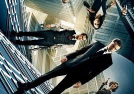
Also in preparation to the creation of my story, I also took inspiration from film. I watched films which followed the style of the Gothic genre such as Tim Burton's 'Sleepy Hollow', 'The Corpse Bride' and other films dealing with the theme of dreams such as 'Inception'. From these films I could see the obvious Gothic horror style in action, and I also saw the surrealistic visuals which bent the imagination. This helped me greatly to create my storyline for the song and for my music video.